Various Logos
I take pride in showcasing my unique logo designs that have been created for a diverse range of clients. Each logo is carefully crafted to capture the essence and individuality of the brand it represents.
From sleek and minimalist designs to bold and vibrant concepts, I strive to create logos that not only visually stand out but also effectively communicate the client's message.
Magic Ship – Shipping Company
A logo, brand and much more created for this Canadian shipping company. The box icon, which is prominently featured in the brand, is a combination of the letters M and S.
The brand pattern, derived from the box icon, is used throughout various applications such as packaging, stationery, and digital assets. Its repetition creates a sense of unity and reinforces the company's identity in the minds of customers.

The Kombuchary – Kombucha Drink
For the rebrand of the Kombucha company, we aimed to strike a balance between modernity and whimsy. The goal was to create a logo that would seamlessly complement the whimsical and illustrative labels we created.
To achieve this, we opted for a modern and sleek logo design. The typography chosen for the company name is clean and minimalistic, exuding a sense of sophistication and professionalism. This choice allows the logo to feel current and timeless.
Harprr – Global music community
A logo created for a marketplace where start ups in the music industry can find advice and help for things like law, marketing, accounting and much more.
The logo is a simple and elegant font incorporated with the music repeat symbol. This nicely complimented the meaning of the name - to harp on, to continue.
Paradise Yoga – Yoga studio
This peaceful yet strong logo features an abstract, organic figure seated cross-legged. The central circle symbolizes inner core and strength, while the upper semi-circle evokes a calm, open mind. The hand-drawn quality of the icon brings a warm, human touch, beautifully balanced by the clean, modern typography.
Taming the Ferrets – Business podcast
A collaborative branding project with lowercase g. The mascot embodies the essence of Taming the Ferrets – playful & intelligent. He represents the podcast's ability to navigate the complex world of business with a sense of humor. Did you know a group of ferrets is called a business?
Through our collaborative branding project with lowercase g, Taming the Ferrets has established itself as a leading business podcast in New Zealand. Taming the Ferrets continues to inspire and educate its audience, proving that even in the world of business, a little fun can go a long way.
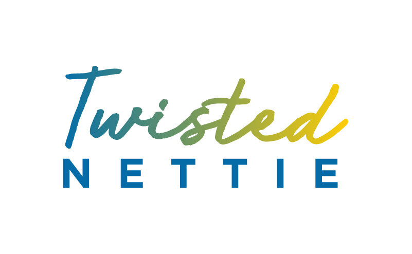
Twisted Nettie - Yarn Supplier
To bring the playful yet professional vision of Twisted Nettie to life, we embarked on creating a captivating logo that would instantly grab attention. The name itself, Twisted Nettie, evokes a sense of intrigue and curiosity, which we aimed to reflect in the logo design.
For the typography, we selected a natural, twisty font that adds a touch of whimsy and creativity to the overall design. To create a balance of professionalism, we paired it with a clean geometric font for the tagline or any additional text. When it came to selecting colors for the logo, we drew inspiration from the Swedish flag.

Fundraising Radicals – Fundraising Courses
Fundraising Radicals believes that fundraising should not be limited to a few powerful nations or organizations. Instead, they advocate for a more inclusive approach, where local communities have the ability to raise funds autonomously and make a significant impact in their own regions.
The choice to use the Peters projection upside down map in Fundraising Radicals' logo is deliberate and symbolic. By presenting the countries in their true proportions, the logo emphasizes the company's mission to empower smaller countries and communities in their fundraising efforts.

Greyburn Farm – Local Farm
We created a stunning logo for a small farm that aims for quality, local, nutrient dense food. They grow food in a considered way, with health (soil, plant and human) and quality at the forefront of decision-making. Additionally, they are passionate about sharing their knowledge and empowering their community through workshops that teach self-reliance.
The logo features a strong bold sun with the silhouette of the Greyburn mountain incorporated at the bottom. The font pairing is contemporary and natural, while still maintaining a professional look.

Mobile Mini Golf NZ – Mini Golf Course
To create a fun and memorable logo for the New Zealand mobile mini golf course, we embraced a playful and memorable design approach. For the color palette, we chose bright pink and soft blue, which not only create a vibrant and dynamic feel but also represent the energy and excitement of the game.
Incorporating elements from the game itself, we decided to integrate a golf ball’s journey to the hole into the logo design. These playful elements add a touch of whimsy and uniqueness to the logo.

Apogee Legal – Legal firm
For the logo creation of the new and young lawyer firm in Whakatane, we wanted to capture their desire to stand out from their more traditional competitors. The word "apogee" meaning the highest point or pinnacle served as our inspiration.
To emphasize this concept, we incorporated a simple element into the logo - a dot placed above the letter "A." This dot represents the highest point, symbolizing the firm's commitment to delivering exceptional legal services. The brand not only captures the essence of the firm's name but also sets them apart from their more traditional competitors.

Honey Bee Kind – Honey Products
For the lively and young honey company, we wanted to create a logo that embodies their fun, whimsical, and down-to-earth personality.
To infuse a sense of local identity, we decided to incorporate native New Zealand flowers such as the Pohutukawa and Manuka into the design. This font choice adds a touch of organic and handcrafted feel to the logo, reinforcing the down-to-earth nature of the brand.

Queenstown elopements – Elopement Company
A fun rebrand for a company that creates tailored elopement packages to create your dream day in gorgeous Queenstown.
We create a simple and elegant logo that represents the essence of romance. The logo features a combination of clean, modern lines, symbolizing the seamless experience.

Made Well – Therapy Clinic
For the branding of the counselling and therapy center in Kentucky, our focus was on creating a warm and inviting atmosphere that would make clients feel comfortable and at ease. The use of calming colours was essential in achieving this goal.
To create a memorable and meaningful icon for the brand, we looked to incorporate the initials "M" and "W" into a reflective design. The reflection symbolizes the introspective nature of counselling and therapy, capturing the essence of self-discovery and personal growth.
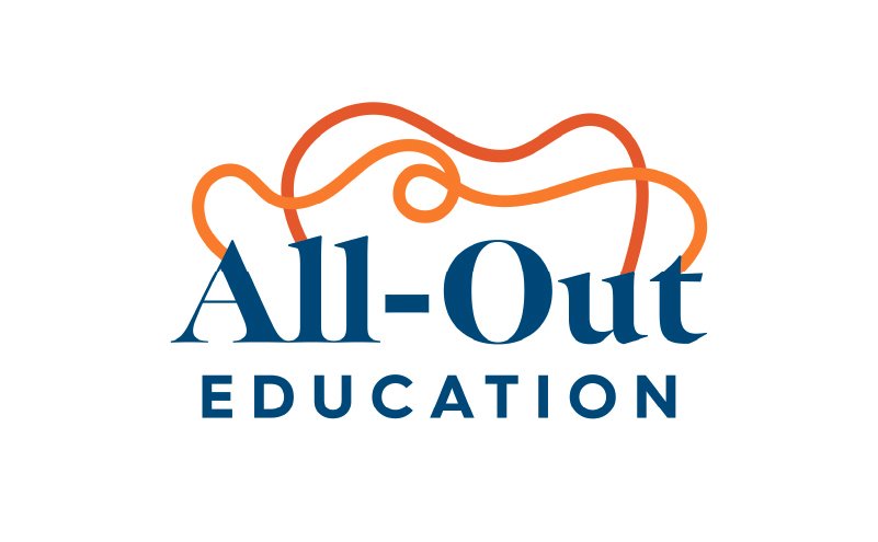
All-Out Education – University Aid
Their programs focus not just on academic achievements, but also on personal growth, metacognitive development, and showcasing individuality.
It was crucial for the brand to appeal to both students and their parents. To accomplish this, we created a professional appearance with a touch of playfulness through the use of colors and a few additional graphic elements.